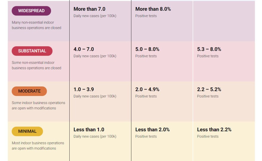
COVID-19 across California is really, really bad.
How bad? Purple-tier bad.
California, along with Ohio and Colorado, employs a color-coded system to warn about the prevalence of the Coronavirus. The basic idea's not unfamiliar for many of us: green is fine, yellow indicates the spread is minimal, orange is moderate, and red means substantial. But purple?
The purple tier lets people know the virus is widespread, with more than eight percent of test results coming back positive over a seven day period. The purple tier is the most restrictive short of stay-at-home orders, and means restaurants can only serve outdoors, amusement parks are closed, office workers must telecommute and various other restrictions.
So purple is worse than red. When did purple become the color most associated with danger?
"Red is the color of alert, of stop signs," agrees information designer Giorgia Lupi, a partner at Pentagram. But she sees the choice as logical. "Purple is the next color in the spectrum, from yellow, to orange, to red."
Lupi's job is to translate data into visual images that are easier for our minds to process. Color, for her, is a vital tool. While purple often carries positive associations in Western culture — such as sumptuousness and royalty — Lupi also points to the color's unsettling lividity. "Think of bruises, and the color purple on skin when talking about disease," she suggests. "It is another level. It's darker, and a more advanced stage, if you will."
Even in the midst of the pandemic, the California Department of Public Health thoughtfully replied to an email wondering why purple for the worst tier, rather than red?
"We chose a color coded system that Californians would be familiar with, based loosely on the state's Spare the Air air quality index," the email explained, requesting attribution to the CDPH.
Of course, many Californians would be familiar with the air quality index; they spent much of the past summer concerned about wildfire pollution. But going back even further, why did the AQI start using purple as a worse category than red? An inquiry to the Environmental Protection Agency led to the following response, from a spokesperson:
In developing the AQI that we have today, the most heated discussions were about colors. At a large meeting in Baltimore (in either 1997 or 1998), we took an unscheduled break during the discussion of colors because we thought attendees were going to start pushing and shoving each other. The focus was entirely around the level of the standard and the color red. Those were the days before the huge wildfires out West, so it was extremely rare to get into the Hazardous range. We mostly hit very unhealthy levels with ozone. Even though we didn't have many continuous PM monitors then, we looked back at the filter-based PM data to evaluate the number of days in different categories.
There were two factions. The environmental groups wanted red in the Unhealthy for Sensitive Groups (USG) category to show that levels were higher than the levels of the NAAQS. EPA and many of the state, local and tribal representatives wanted red in the Unhealthy category, because that's when the AQI indicates that air quality can pose a risk to everyone. We were also concerned about message fatigue. In those days, it wasn't unusual to have 30 days when ozone was above the level of the standard.
We are not sure anyone knows for certain how the final decision was made, but in the end, DC decided to go with red at the Unhealthy category. The higher colors were decided by the AQI Team to show that as air quality worsens, it can be unhealthy for some people before it's unhealthy for everyone. And even once air quality reaches unhealthy, higher levels can dictate different actions. At orange, members of sensitive groups may have effects; at red, some members of the general population may be affected, and the effects to sensitive groups may be more serious. At purple it's an alert, and the risk is increased for everyone. Maroon - hazardous - represents emergency conditions. We don't typically see that except for wildfires and occasionally, dust storms.
"Looking at the data," she says, "if we put red as 'hazardous,' it would never occur."
Now, of course, hazardous days are not uncommon, and at least in some places, the AIQ is turning to an even worse color: maroon. (Black, as it turns out, is less legible on maps, and it's hard to see borders.) For now, purple continues to show how royal a mess we're in.
Copyright 2021 NPR. To see more, visit https://www.npr.org.


