
Nearly every country has a national flag, a national anthem, a national bird. Not many countries have a national typeface.
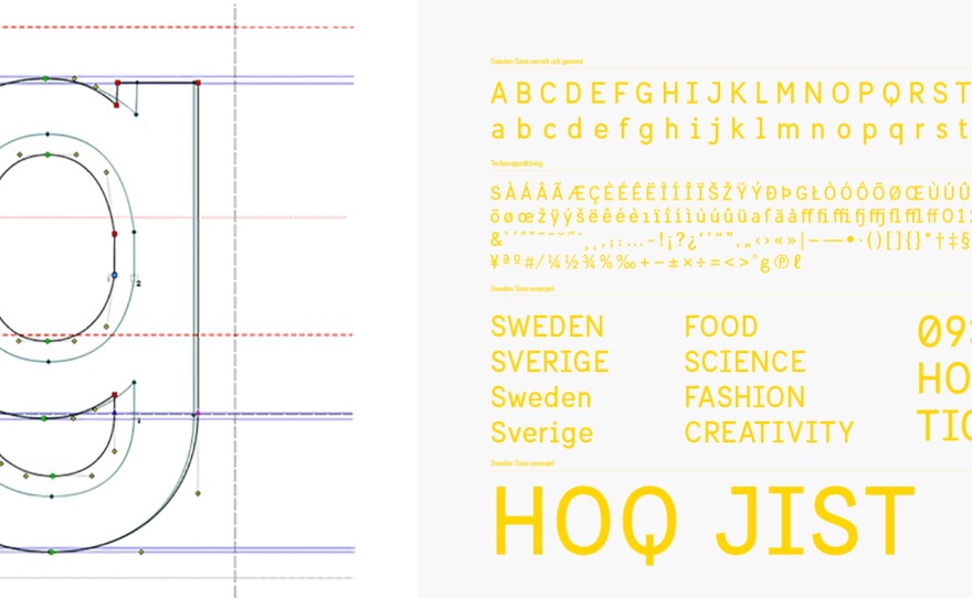
Sweden recently commissioned a team of designers to come up with a font to represent the country on its websites, press releases, tourism brochures and more.
The offices of Soderhavet look exactly the way you would expect a Scandinavian design firm to look: clean, sleek and warm, with tasteful bursts of color sprinkled among the minimalistic furniture.
And the typeface that these designers created looks pretty much the way you would expect a Scandinavian typeface to look, too.
"The Scandinavian tradition is pretty humble, easygoing and clean," says Stefan Hattenbach, one of the designers of the new Sweden Sans. "Less is more, you could say."
He started by collecting images of old Swedish street signs and company logos. He pulled images of Swedish wallpaper, cars and furniture, and looked for what he calls the red thread running through it all.
"There's an expression in Sweden, too," Hattenbach says. "We say lagom, which is not too much and not too little. You're happy with something in between. And that's a special word which I guess only Swedes would understand."
The final product tries to embody that idea of lagom. The font is simple — it doesn't shout. There are just a few flourishes, like the capital letter Q: a line comes straight out the bottom of the letter like a lollipop stick.
"Q is not used that much, so you can often be a little more playful with that," Hattenbach says.
Mess with the letters A or E, and you're doomed.
That's the funny thing about a typeface. If people notice it too much, you've failed.
"There's a very famous quote, which is that a typeface is the clothing of the alphabet," says Paul Bailey, a brand consultant at the British company 1977 Design.
"All your clothing choices are designed to reflect a certain type of personality, that says, 'This is how I am,' " he says. "It's exactly the same with a typeface."
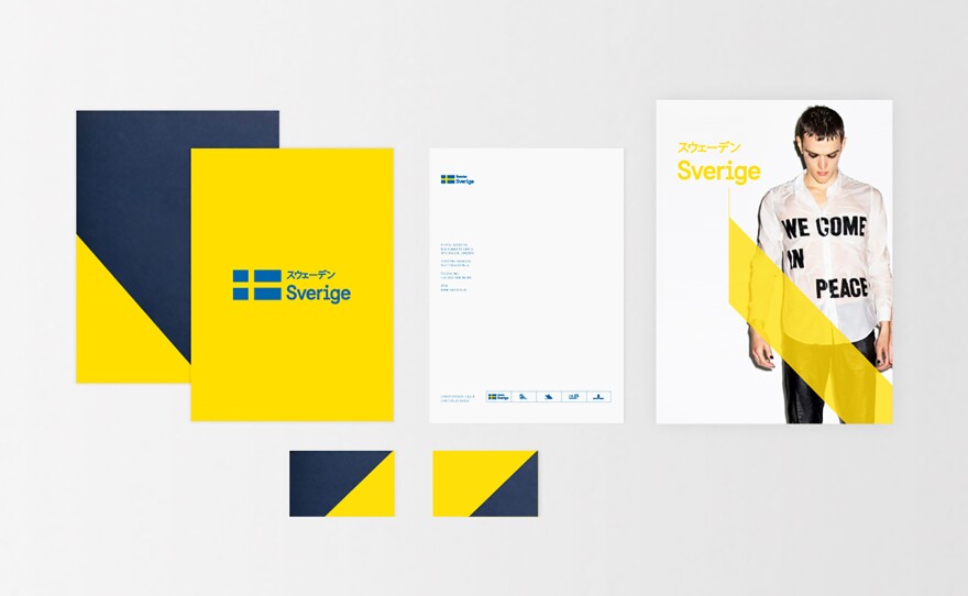
Lots of cities have their own typeface, but it's much more unusual for an entire country to do it like Sweden. The font is part of a wider national branding project.
"What I see with the brand as a whole is its capability to communicate both the Ministry of Foreign Affairs, but I can also see the typeface used when it's talking about potential tourists coming to Sweden," says Matthias Svensson, the creative director of Soderhavet, the agency behind the campaign.
Some people might argue that Sweden already has an unofficial typeface — Ikea is a massive Swedish brand with global reach and its own lettering style.
And frankly, Sweden Sans doesn't look hugely different from something you'd see in an Ikea catalog.
Branding experts say that as it should be: Both are trying to reflect the essential ineffable character that is Sweden.
Copyright 2015 NPR. To see more, visit http://www.npr.org/.


